The Syntoniq Logo
Here's the Syntoniq logo. This section describes the visual elements and their meanings.
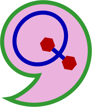
The logo was hand-coded in PostScript and converted programmatically to SVG. You can find the logo in the logo directory of the source repository.
Colors
The green, blue, and red colors in the logo are based on the LED colors used on the keyboard. They are intentionally simple colors. The pink background was picked just for its visual appeal.
Shape
The overall outer shape of the logo is a comma. This is because of the syntonic comma, which is the ratio 81/80. This is discussed in the section on the Syntoniq Name.
The outer shape is an Archimedean spiral. The Archimedean spiral expands linearly, which makes it very convenient for graphing pitches. You see a lot of spirals in the microtonal community.
The Q comes from the Q in the name "Syntoniq." It also provides a convenient way to work in the hexagons, which are a nod to the hexagonal keys of the HexBoard, Lumatone, and Terpstra keyboard design. The hexagonal grid is ideal for isomorphic keyboards.